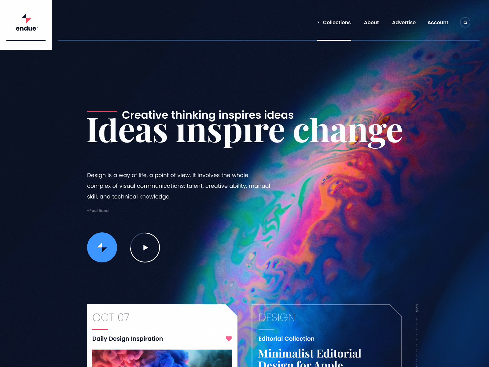
Landing page - Investment fund / cryptocurrency / ico
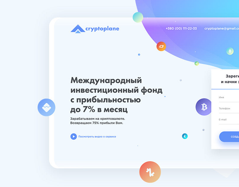
Investment fund. Earnings on cryptocurrency.
We curate topical collections around design to inspire you in the design process.
This constantly-updated list featuring what find on the always-fresh Muzli inventory.
Last update: 12/4/2025
Investment fund. Earnings on cryptocurrency.
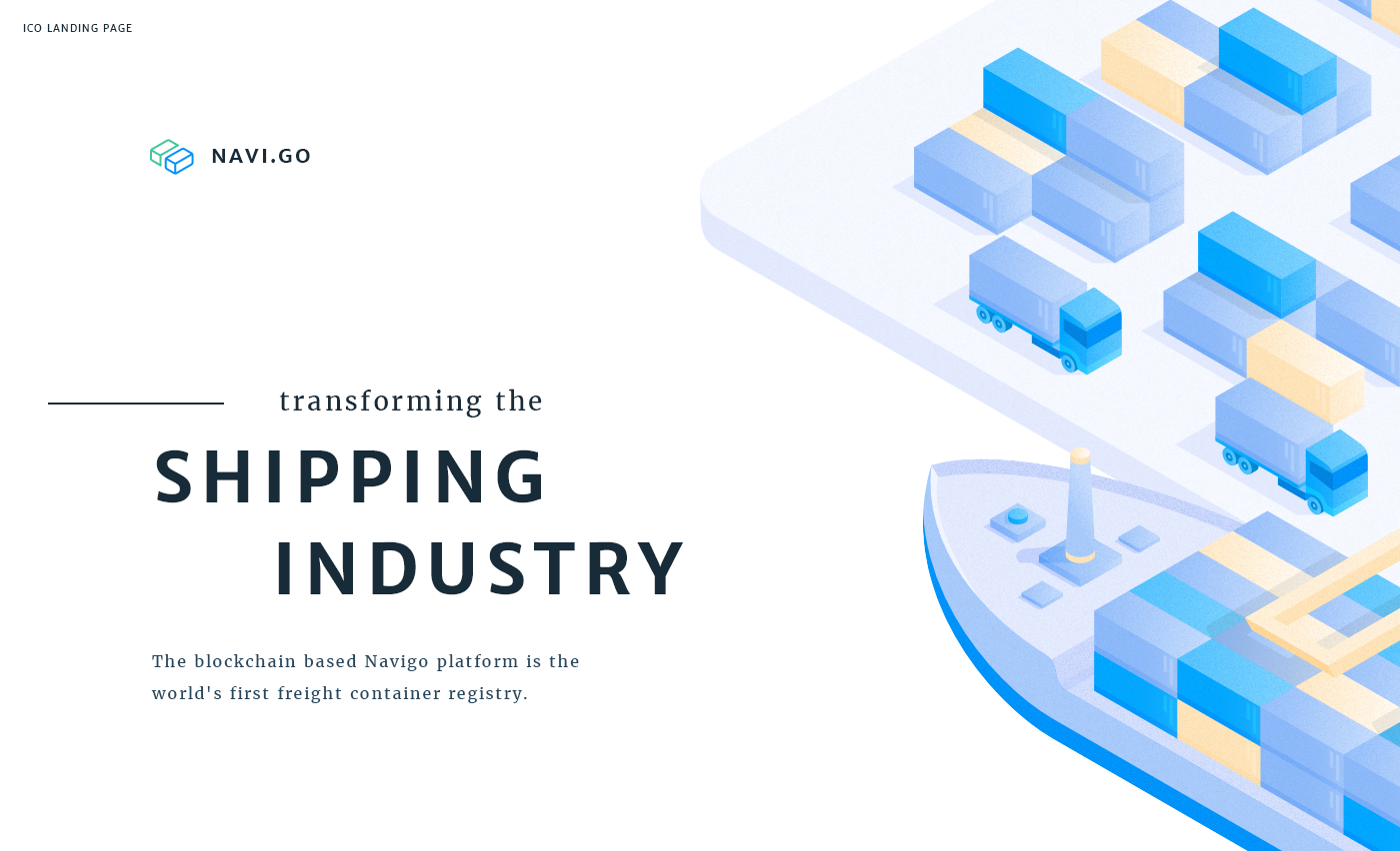
ICO Landing page for blockchain based Navigo platform. Navigo is aiming to transform the shipping industry by being the first freight container registry.
Teaser Landing Page site web page landing
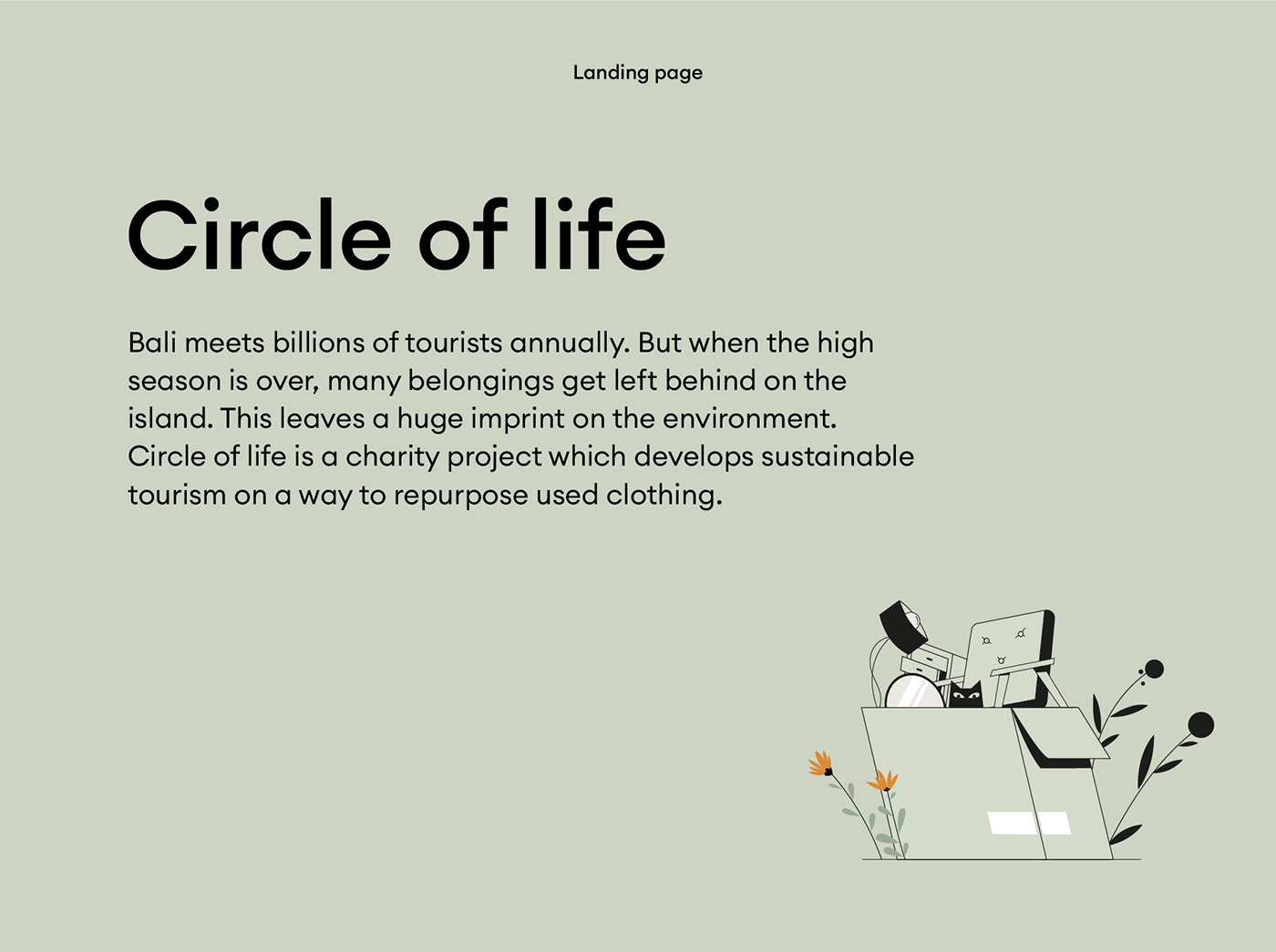
Bali meets billions of tourists annually. But when the high season is over, many belongings get left behind on the island. This leaves a huge imprint on the environment. Circle of life is a charity project which develops sustainable tourism on a way to repurpose used clothing. We developed a landing page based on a smooth digital animation, and chose a soft pastel color palette. The structure of the landing is adaptable and convenient so anybody could get the main message behind Circle of life.
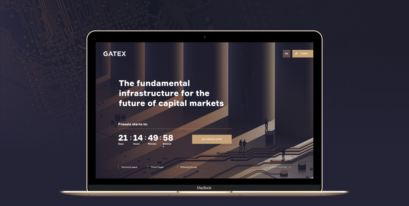
Gatex landing page is an example of how a unique, special illustration style defines the project. The style is inspired by Wall Street — tall, majestic buildings, and passion, and aspiration of those who work there. Animation Alias Background Banner Bitmap Field Cascade Depth Validation Verification Engage Atchitecture Fluid Font Readability Gestalt Graphic Fidelity Hue Hybrid Model Icon Placeholder Internationalization Feel Luminance Masthead Monochrome Monospace Navigation Negative Space Density Flow Template Panel Parallel Consistency Industrial Proportional Rapid Rollovers Rollover Scanability Scroll Similarity Site Map Storyboard Tab Tagline Target GUI User-centred Waterfall Content Widget Hierarchy Kerning Ascender Descender Tracking Leading Kerning Orphan Serif Sans Script Slab Legibility Alignment Quote Palette Scheme Logo Sketch Grid Framework Column Row Scale Texture Collaboration Commercial Craft Decor Feature Innovation Trend Yo Isometric izo wallet comp
yet another website in progress. #staytunedformore
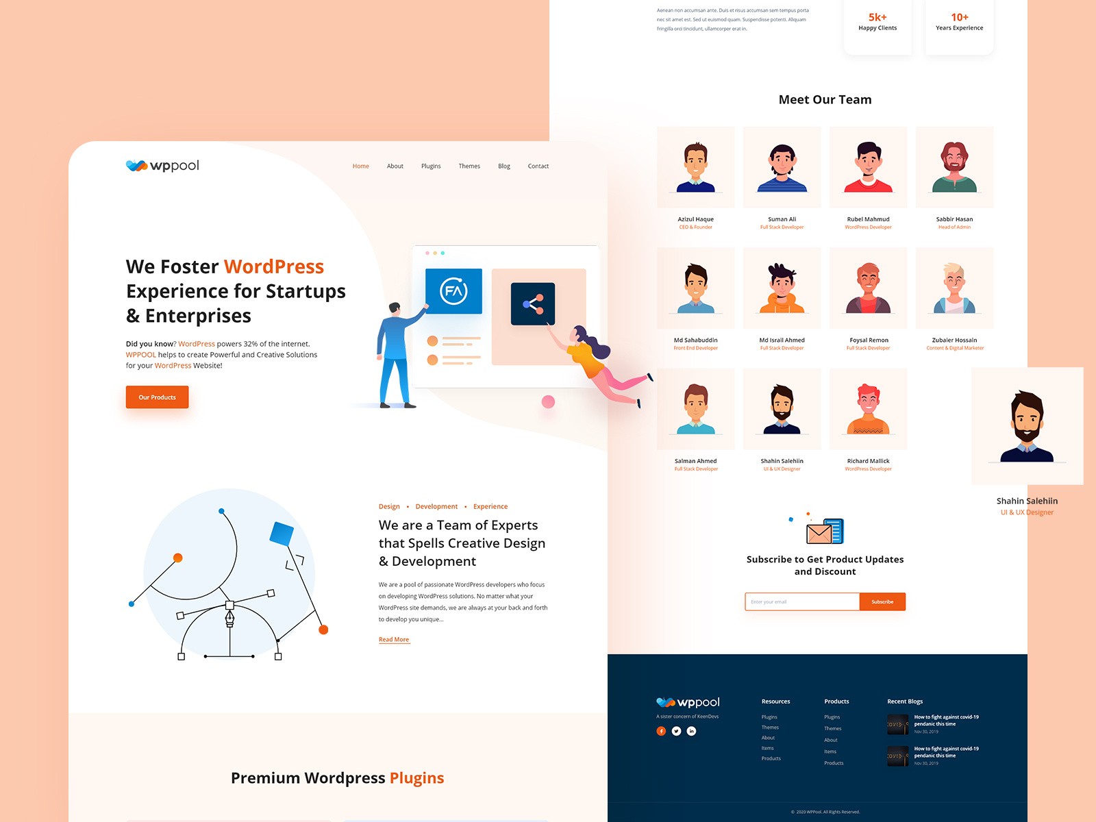
Hello World! WPPOOL is a software company based on intelligent designers and developers where we develop WordPress products to help the business solve their issues. WPPOOL Is Live Now

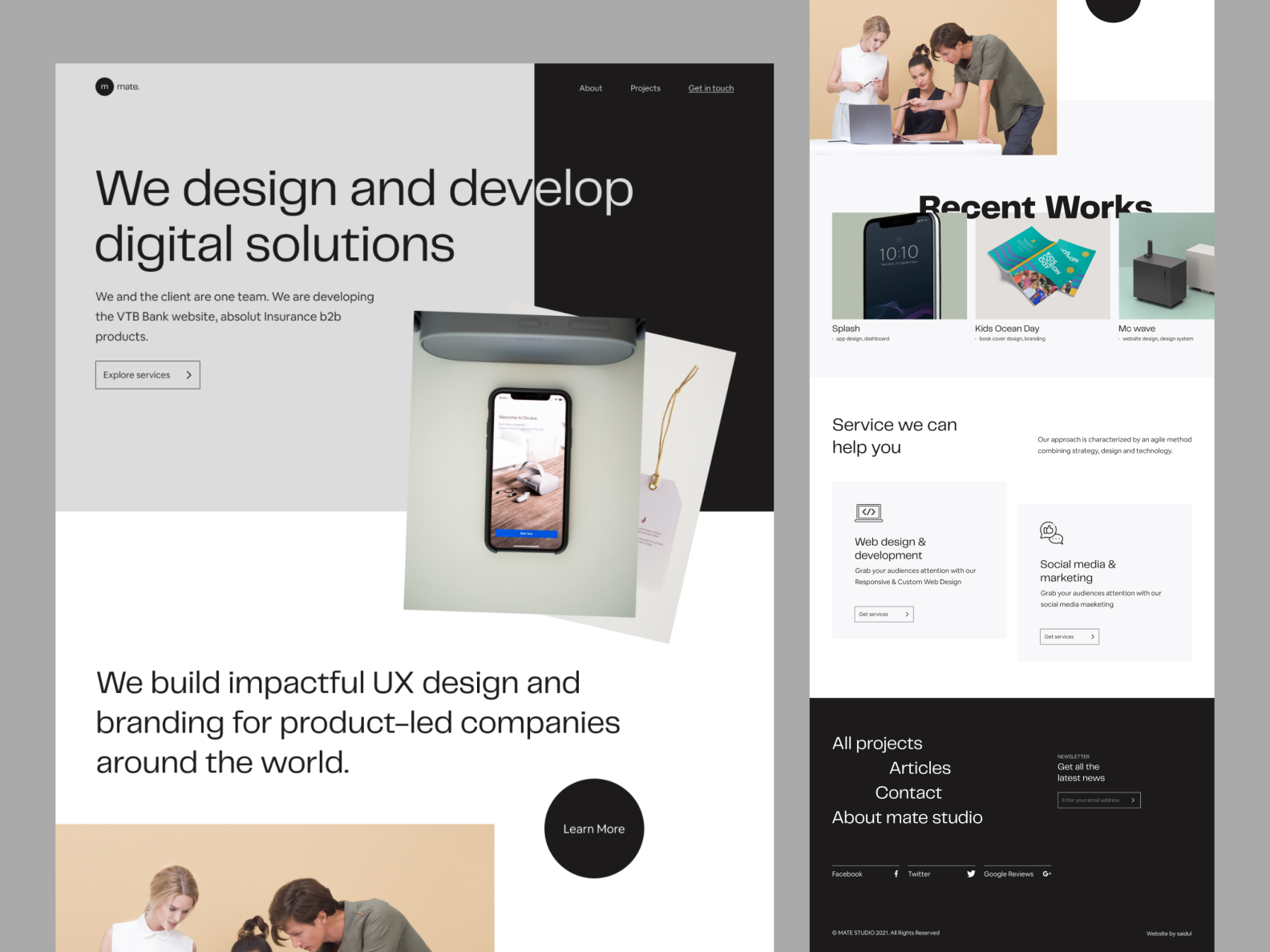
Hello folks!!!Hope you're doing well.Today I'm sharing a new Digital agency landing page called "mate". Hope you'll love the design. Let me know what you think about the design and don't forget to press the 💖 "L" button 😎_______👉Have a project to discuss?Say hello at: mohammadsaidul2k19@gmail.com_______🥰Follow me on: Instagram | Linkedin | Behance

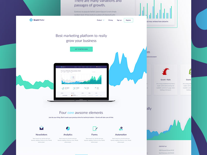
Ssssup, dribbblers! Another day of exploration! Here I present my latest design exploration about finance landing page. At this platform you can control your financial report easily, make a challenge to boost your productivity, and many more. Hope you guys like it. Don't forget to give me some loves and feedbacks. Cheers! We are available for new projects 📫 Email : hello@vektora.studio 🎯 Skype : Keep in touch 😀 Instagram : vektora.studio 🛍️ Ui8 : Vektora Shop
Shopify Landing page What do you think? Give your opinion in the comments below!😉 Hope you like it and feel free to leave comments and feedback. Thanks! :) Arafat Mahfuz Do you have any project ? Feel Free to contact me Email: arafatmahfuz06@gmail.com Follow Us: Instagram | Dribbble | Behance | Facebook

Hello Dribbbles, Haruki Design is the first experience-driven design agency for brands who want to make an impact on their customers and when you're not aiming your products or services at a mass market, you need something different from a traditional ad agency. What is your opinion? Share your thoughts and don’t forget to have your apple a day! Awesome Resource: Iconly, Unsplash *********** Press the Like button or 'L' to show some love ❣️ and follow me on Instagram ! Thanks for watching 😊 Make your project more awesome! Connect with us: owwstudio@gmail.com Instagram | Behance | Shop at UI8
When you’re directing visitors to a specific page on your website, you want it to stand out. Your landing page reflects your brand and is your chance to get new... The post 11 Landing Page Design Tips You Should Follow Today appeared first on Design your way.
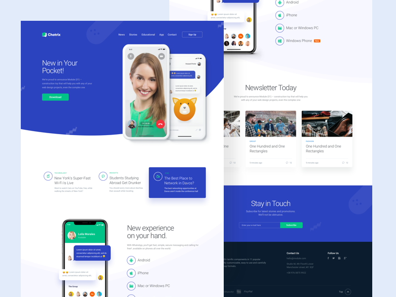
Hi Everyone, it's been a while I didn't show up, today is the chance for me to show you one of my prototype for Chat app that I called Chatrix. They are many other chat app that able to do video call, send some messages with the picture or text, but here there's a special feature on this chat like an animoji base on face recognition that implement to many different kind of smart phones today. Feel free to leave feedback and comment don't forget press "L" if love it. Thanks ! ---------------- Make your project more awesome!" Connect with us : owwstudio@gmail.com
Project Inquiry: brandoxideoffice@gmail.com

Antimarket is a complex software solution allowing food retailers to quickly enter the E-Grocery market

The landing page concept for the SkillBox intensive design course.

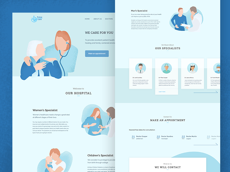
Download UI Kit From Devignedge UI StoreSharing Medical Healthcare Service Website Landing Page. This design is suitable for Medical Healthcare Company who is serving Healthcare service to their customers.Follow us for more update.Press "L" to show your love ❤️️Available for taking the new project, drop a message on manikstk@gmail.com or skype to schedule a video call.
Hello Dribbblers! Here is my another exploration work. I've used Adobe XD for this design I am hoping that you will find it interesting. I would love to hear your valuable feedback / criticism :) Download your Copy Now! ----------------------------------------------------------------------- Inspire me & Show some love by Press " L" ----------------------------------------------------------------------- Follow me on : Dribbble l Behance Have any project in mind ? Drop me line : iamtushar75@gmail.com

31/100 days UI challenge Ecommerce Landing Page Design ------------------------- Follow me : Uplabs | Behance | Instagram | Twitter | Facebook


✨Bonjour!This is my exploration of Home Interior Wallpaper Provider - Landing Page, hope you like itNeed the design services? Please just focus on building your product, don't bother yourself with crafting branding, marketing design, or even the website.Let us handle them. Just send a brief to: hello@keitoto.com— — — — — — — — — —As always, we are Keitoto provide you complex service from:1. UI/UX (both mobile-app and website)2. 3D animation3. 2D illustration4. Front-end development5. Pitch deck/presentation design— — — — — — — — — —Want to collaborate? Email Us: hello@keitoto.comKeitoto | Behance | Instagram | UI8
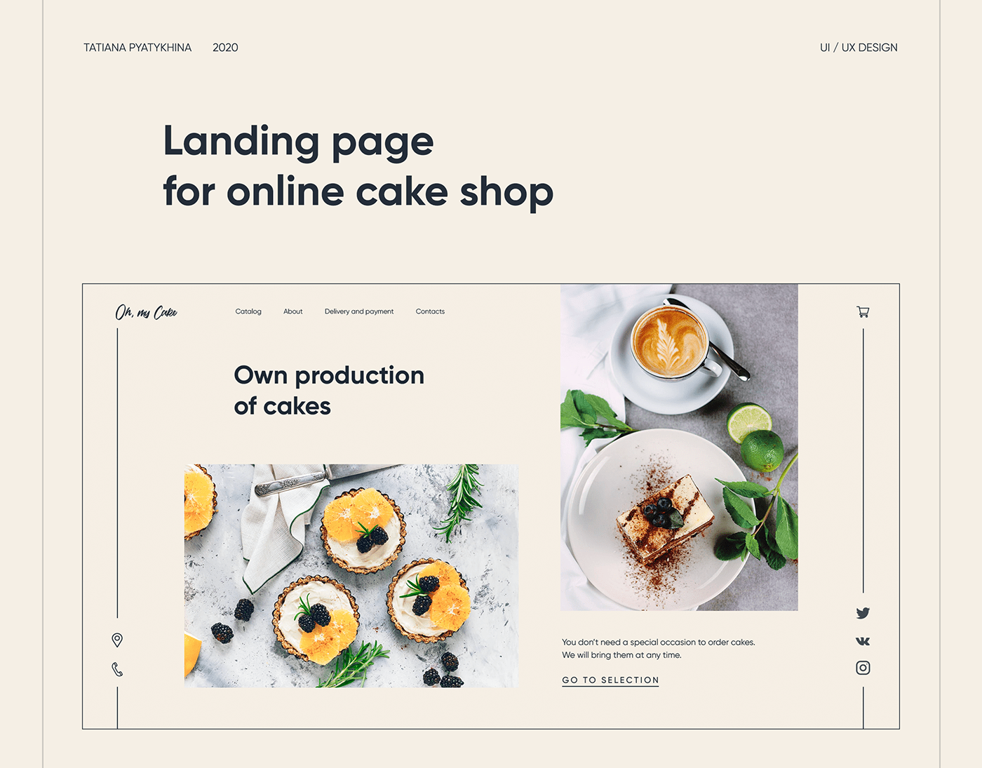
Website design for a company from St. Petersburg, which has its own production of cakes.

Hello Dribbble, First let me thank @[1101328:Catarina Santos] for the opportunity to be part of this awesome platform and community. Little background: I'm based in Porto, Portugal. Have a Communication Design college degree. Done some Freelance work before but mainly focused in Branding and traditional Graphic Design projects. As I always loved Tech and the Digital world and unfortunately my degree wasn't really focused in making web content I'm kind of self learning about this web related subjects :) Now I want to grind even more as I find UI/UX to be one of the best and most fulfilling areas in Design. As my first shot I would like to share with you the landing page of a Startup I was part of. As the project was focused on UX I had a really big responsibility on my shoulders to get this right... Also, it was probably my first big project since I started doing UI :) You can see the full project here: https://www.behance.net/gallery/67064459/Uxtopia-Landing-Page-Web-App-Design Hope to get Dribbble's grips and share even more stuff with you in the future. Thank you, Válter

Hi Dribbble! This is a Landing Page for a new Cleaning App Services that I have been working on for a startup. I hope you like it!

Happy Tuesday Dribbblers! We wanted to show you what the landing page of Luma token, that is the utillity token for Alluma project, looks like. Alluma is aiming to be one of the largest crypto currency exchange in emerging Asian markets, we are very happy to have put or creative touch to the process and we hope they achieve their goal and shake up the market and help people make some money! What do you guys think? Hit that “L” if you like those colors! Hit us up on hello@flairdigital.co to discuss what you are doing and how we can help. Flair Digital | Instagram

Hola Guys! Here is my recent project sliozo, It is fruit drinks product showcase landing page. Your's feedbacks alway welcome here :) Olipop Branding credit : Marc Berenguer Thanks


Hi! 👋 This is my design of the Accounting Agency landing page concept. Do you like it? I appreciate your feedback! Ask me anything: flaragd@gmail.com 👀 Have a great day everyone!

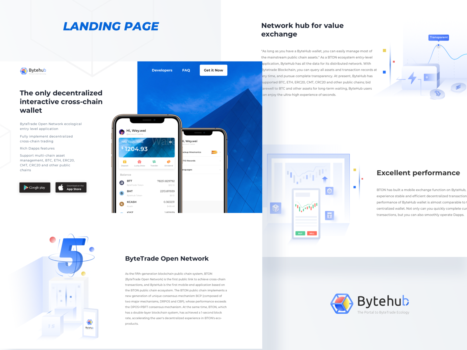
bytehub Landing Page.
Hello guys, This is our new shot on Digital agency landing page. You can find the different section and all kinds of the element which should important to stay in a digital agency website. Tried playing with visually pleasing, simple colors and keep it simple and cool. Hope you'll find it interesting. Your feedback is always appreciated. If you have any feedback in your mind, then drop it in the comment section. Don't forget to check the attached file. Press "L" to show us some love. we are open for new projects! for more, email us at hello@techcare.co

Hey, dribbblers! Quick overview: Krnc is a decentralized version of the money in your bank account. You don't need to pay for it — it's digital cash you already earned. Objective: the conversion rate was really low. The main objective was to tell a better story and create a gradual path to engage new users. Everything on the page leads to one single goal: the CTA. Used fonts: Moderat: it is a geometric sans-serif typeface designed by Fabian Fohrer and Fabian Huber. Moderat is available in two weights—regular and bold—but doesn’t contain italics, so it is best suited for display use. Don't forget to press "L" if you like it and check out attachments. Cheers!

Illustration : Vijay verma Instagram | Behance | Website For Project Enquiries - divan@greydeskstudio.com


💌 Have a project idea? We are available for new projects info@ronasit.com | Telegram | Facebook | Linkedin | Website Here's our Klarna landing page redesign. What's Klarna? It's a Swedish shopping app that offers a variety of features to elevate your shopping game with tailored style recommendations, exclusive deals and drops from the brands, and a system of deferred payments charged automatically from your card. We redesigned the first landing page block and simplified the website navigation. Now there's a clear and dynamic call to action (added a bar to enter your phone number and get the app). We kept the black, a corporate color of the bank, and just slightly changed the pink background of the current page. We wanted to save as much of the original vision as possible but enhance UX and boost micro-interactions. How do you like our fresh minimalist remake?
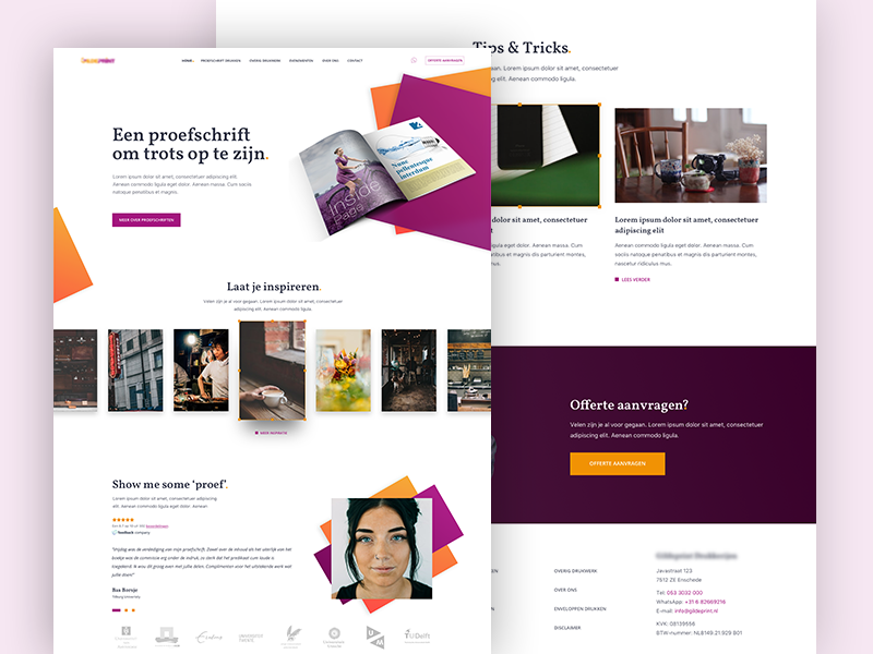
Here is the homepage I created for a company specialising in printing dissertations, theses and other publications in book form.
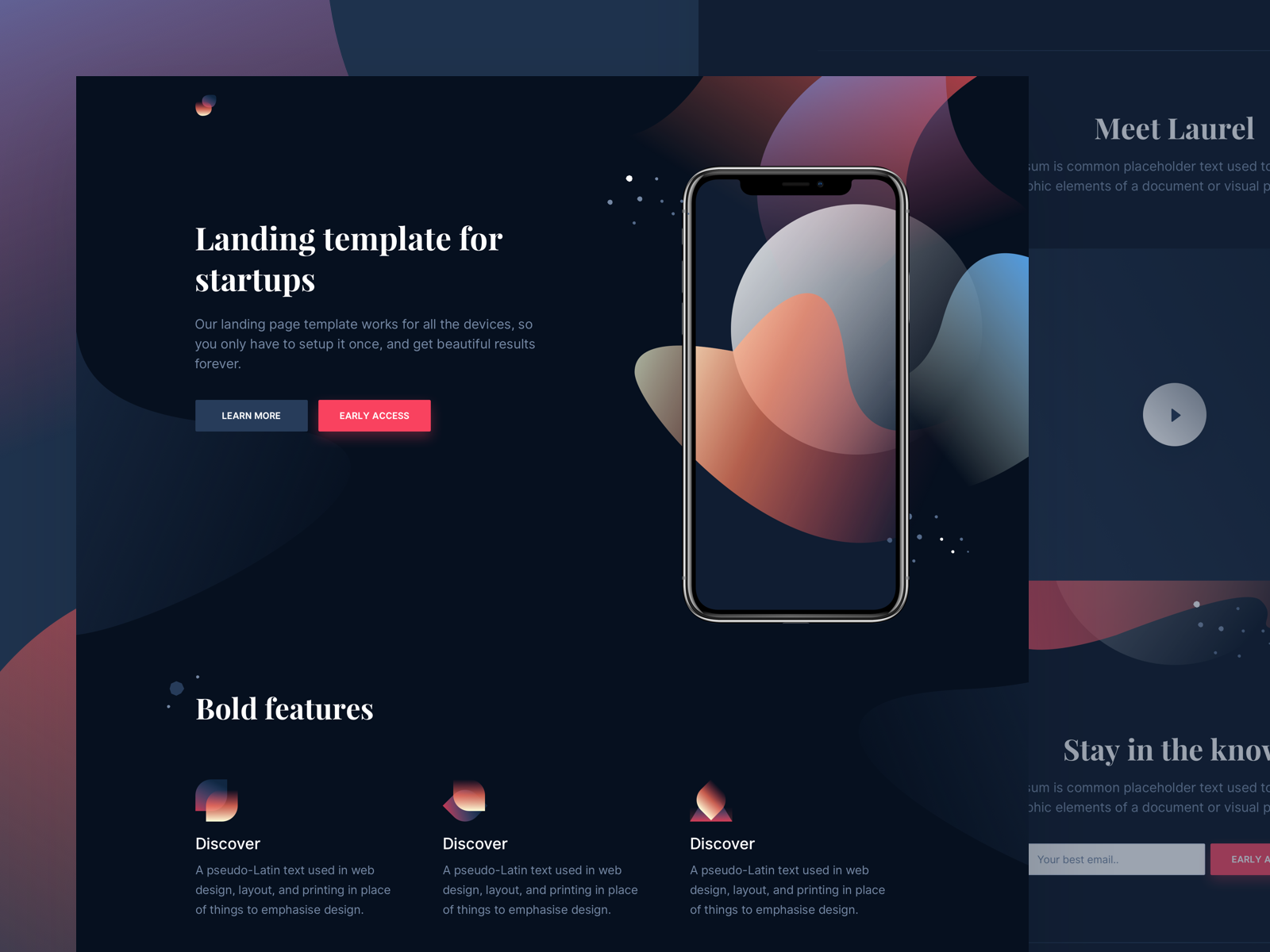
Hi guys 👋 We've just shipped a new landing page template on Cruip.com! Meet Laurel 👉 https://demo.cruip.com/laurel/ I hope you will find it useful for your personal and commercial projects. Cheers, Davide
Get access to thousands of freshly updated design inspiration pieces by adding Muzli to your browser.
Loved by 750K designers worldwide, Muzli is the leading go-to browser extension for creative professionals.
In general, in the digital marketing world a "landing page" is a page on a website that targets specific audience with a specific Call to Action (CTA) designed to convert visitors into leads, registered users, download software, fill out a form, start using a product or service- or anything that creates value to the company. A page dedicated to conversion.
For example, you want users to leave their email address so you could offer them great deals on the amazing products you sell from time to time.
Alas, many landing page examples have become very similar both in structure and appearance, almost identical as if they all came out of the same cookie cutter- there is a title, a very short paragraph conveying the core message and a CTA, usually accompanied with an illustrated or a photo background.
Although this structure proved to be effective, it makes it very hard to tell landing pages apart, which over time caused them to be perceived almost as banners with all the drawbacks that holds.
So why should you care about landing page design? Because it’s important to stand out in order to get your audience’s attention, and that’s all about design. Good design.
We've also recently published an article about what makes a great designed landing page and best practices. You should definitely check it out.