
Design Inspiration
Profile page design examples
Hundreds of creative, innovative, well designed user profile pages ideas & examples.
We curate topical collections around design to inspire you in the design process.
This constantly-updated list featuring what find on the always-fresh Muzli inventory.
Last update: 12/3/2025

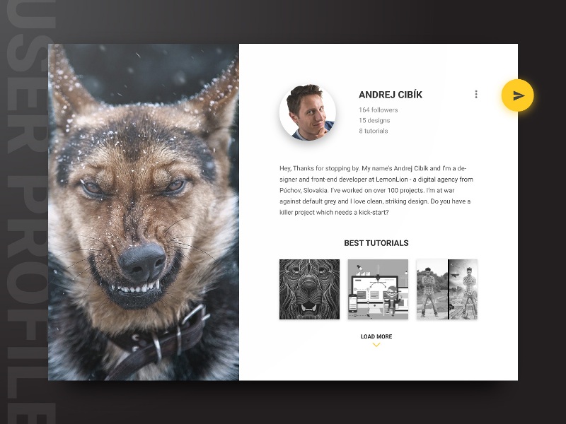
MatDash User Profile Page Design

User Profile - UX exploration

User Profile Account settings

MatDash User Profile Followers Page Design

User Profile Screen

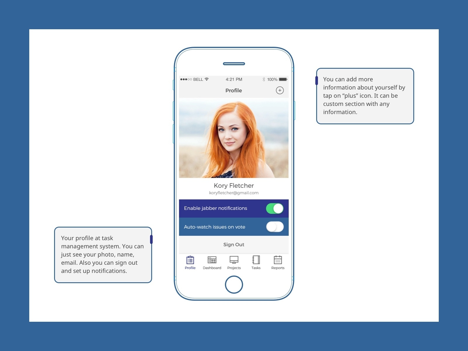
User Profile

Multifunctional user profile page

Profile page / User management · Koala UI

User Profile Menu 👤
User Profile Interface Design

User Profile

User Profile concept

User Profile Page | Light mode
User Profile Page Light mode
Daily UI challenge #006 — User Profile
Hello all! Here is my 6 daily UI shot :) #006 — User Profile

Daily UI Challenge #006 - User Profile
#dailyui #dailyuichallenge #006 Behance - https://bit.ly/2UfdjgP
User Profile - Music Player App UI Concept
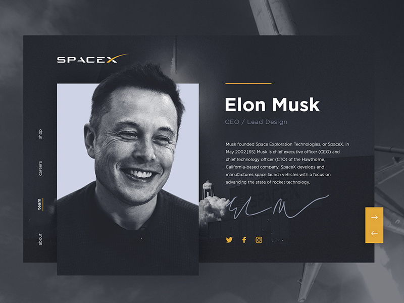
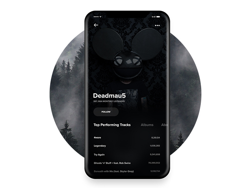
Daily UI #006 - Elon Musk User Profile.

#006 User Profile | 100 Days of UI
Day 006 of the 100 Days of UI Design Challenge. User Profile. In this case it is an user profile in a music service specializing in electronic music
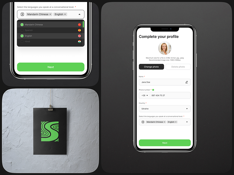
Spirit_Bridge | User profile setup and schedule options

Daily UI Design Challenge #006 - User Profile
6/100, I've decided to design user profile in my concept app for photographers, where they can share and rate photos, kinda dribbble-ish

WPay - Wallet User Profile and Financial Statistics

User profile

Bionic (Reddit client for iOS) User profile view

Daily UI - Day #006 - User Profile - Dark Theme
✪ STREAMUP is a streaming application on iPad, this app will help streamers to ▶ Stream their videos all the time ▶ Customize layout ▶ Upload their own blogs ▶ Change the theme into dark ▶ Make friends with other streamers Let's enjoy them! ヅ
Daily UI #006 #007 - User profile and settings
Day 6 & 7 of the Daily UI challenge - user profile and settings 👤 Have started the challenge again after taking a break to focus on some personal stuff 🤓But am back and really enjoying it - hope you like this one! 🙂
User profile for Animal Crossing - Daily UI 006
Being a big fan of the game Animal Crossing by Nintendo, I decided to create a profile for this game where we can publish pictures. Don't hesitate to give your opinion! More information: https://sketchbook.tsukimori.co/projects/user-profile-animal-crossing-daily-ui-006/
Redesigning the UI & Shopping Experience for Uniqlo HK app
Redesigning the UI & Shopping Experience for Uniqlo HK app AoiroStudioJul 08, 2019 Zion W is a brand & UI/UX designer based in Sydney, Australia. He shared a great redesign of UI and the shopping experience for one of my favorite clothing brand out there: Uniqlo HK app. I am currently using its North American version and it's a disaster in terms of its entire experience (💡). There are several things from Zion's concept that I dearly appreciate. First and foremost, its user interface is simplified and there is a consistency in the patterns for an e-commerce shopping experience. Another great feature is the 'lookbook', having a visual sneak of what you are buying especially a 'new' collection truly helps create conversions into sales. Give it a look! The all-new UNIQLO Australia app, with coupons, visual search, store locators, Look Book and other shopping features. More Links Personal Site Behance User Interface Design Work by Zion W More Links Behance
Daily UI 007 User Profile concept for Instagram web
Hi everyone Instagram is a network that we use more and more, however the desktop version is a bit basic for what we need every day and all the tools in a quick way to publish and see the analytics of our profile This shot is a rebound of @[443226:Masudur Rahman ] I love your work. I hope you like this work , I leave my networks if you want to see more of my work Instagram • Behance • Facebook

User profile for Tapr. Build Better Connections. Digital card

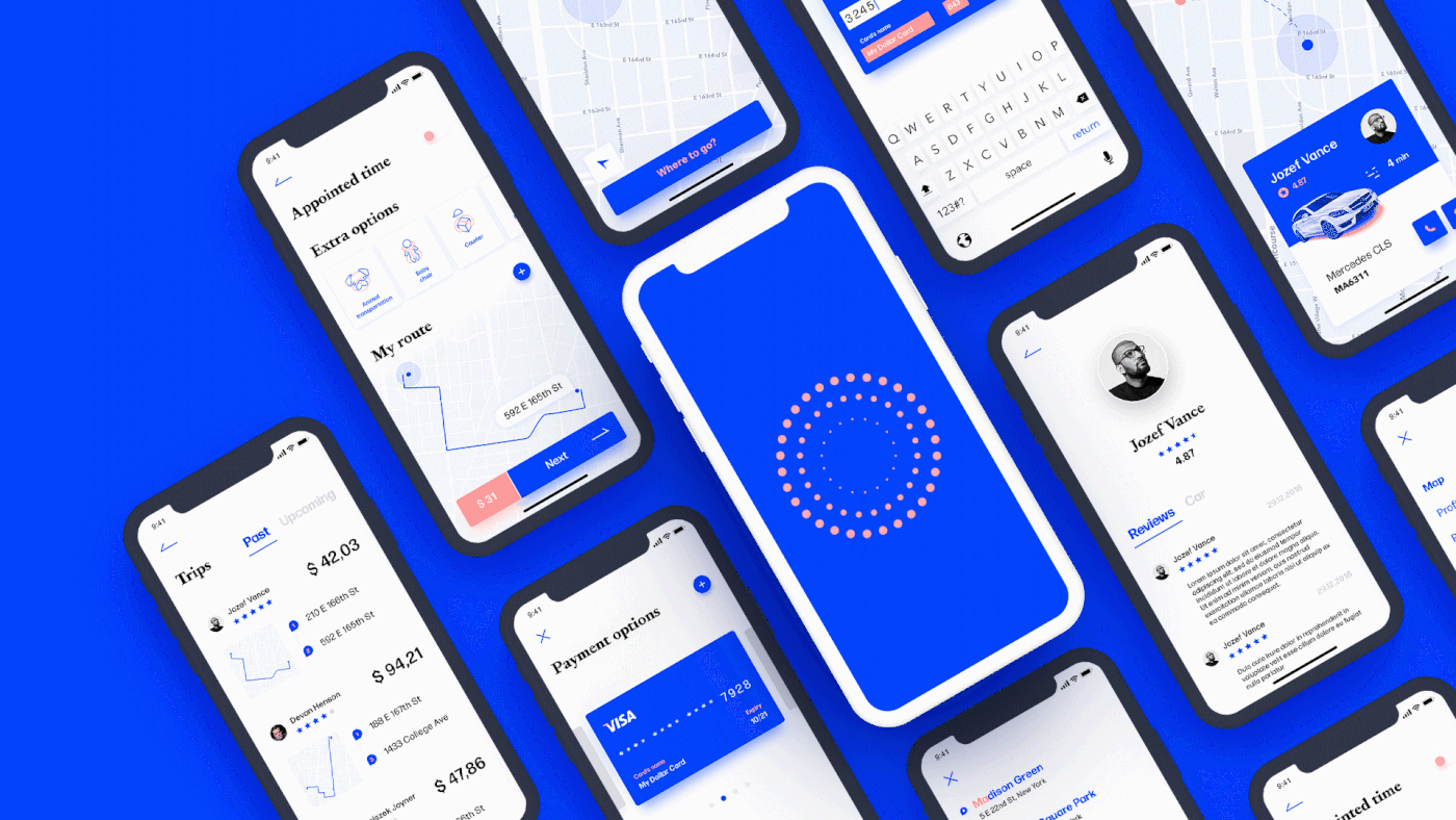
Lyft- A new user profile for rider and driver
👤Currently we shipped a new user profile for both rider and driver! We believe this could be a baseline to create a personalized experience and offers value to the user to an ownership of their account.

User Profile

User Profile
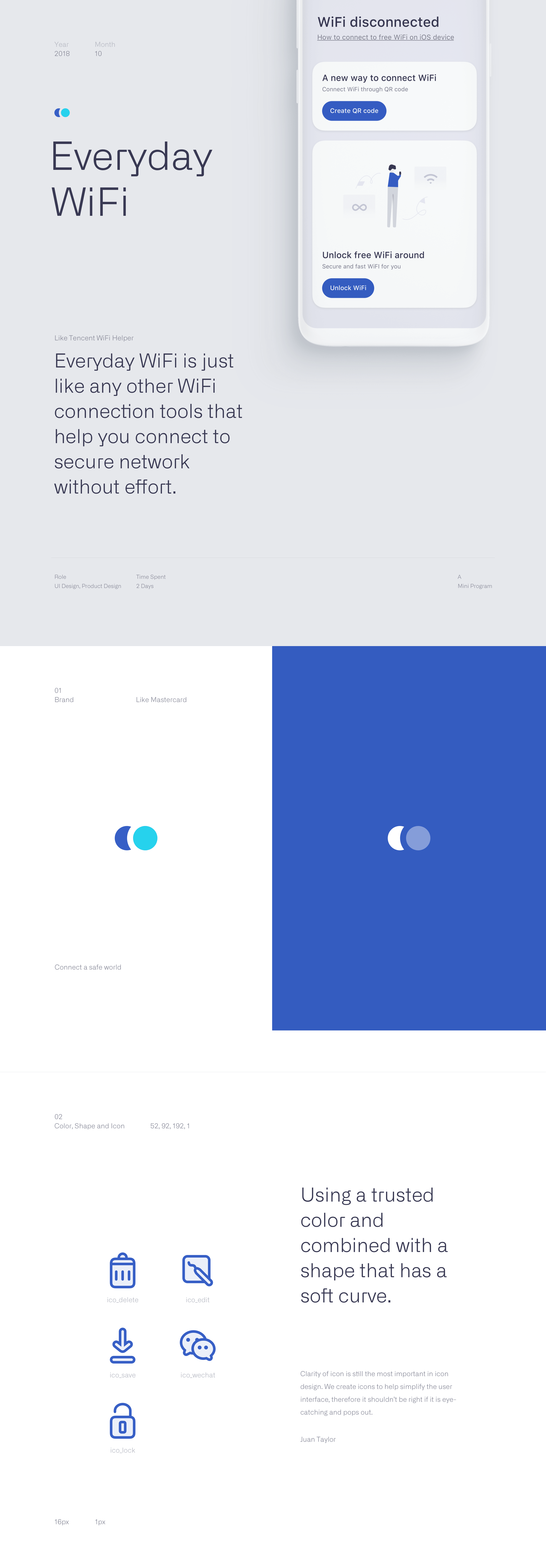
An Insight at the User Interface for Everyday Wifi
An Insight at the User Interface for Everyday Wifi AoiroStudioMar 21, 2019 Let's take an insight at the user interface for Everyday Wifi, a design by Linwu Wang. A designer based in Hangzhou, China. Unlike any Wifi helper application, the Everyday Wifi has been revamping the entire experience to facilitate the connection to a secure network without any effort. Especially knowingly when you are living in a country like China where there are billions of people, having a connection tool for the Wifi must a be plus. The visual design is much more quite simple and inspired by cards; that makes everything more readable and following a path that wouldn't derail the entire user experience. What do you think? Everyday WiFi is just like any other WiFi connection tools that help you connect to secure network without effort. Links Huaban Behance
Packaging & Logo Design for Vizou's reading glasses collection
Packaging & Logo Design for Vizou's reading glasses collection AoiroStudioSep 30, 2019 I am starting to be attracted to showcasing work and projects that aren't related to 'user interface' and user experience. It's probably because I work into this field but having the opportunity to share whatever inspires us what makes me keep going with ABDZ. With this momentum, I would like to share the work of Studio Chapeaux and what they have done for Vizou's reading glasses collection in terms of graphic & packaging design. I personally love its subtle and touchy detail on the packaging that defines if your eyewear evolves in dioptric strength and how the graphical elements evolve accordingly as well. The comprehensive graphical identity evolves according to the dioptric strength, form and tonality of the respective eyewear model. A reading glasses packaging that grows with the needs. Graphic & Packaging Design By Studio Chapeaux About Studio Chapeaux They are a boutique of ideas and design bureau based in Hamburg, Germany. The majority of their work is focused on graphic, packaging design and branding. Make sure to follow their work! Studio Site Behance Instagram

Stylish Use of Textutre in Illustration: Wizje Magazine
Stylish Use of Textutre in Illustration: Wizje Magazine abduzeedoJan 18, 2019 Tomasz Woźniakowski shared a beautiful project on his Behance profile. It’s a set of illustrations he recently created for the newest Wizje magazine publication which is a polish collective of young people promoting poems of various writers. The illustration style is top notch, I especially like the usage of texture and depth. I feel that is a much better alternative to the ultra flat and vector look. Adding noise to shadows adds a lot of style to the illustration Another awesome thing to mention about this project is that Tomasz is a design student. We love supporting and helping students to get their work out there. So if you want to ge feature on ABDZ let us know. Meanwhile make sure to check out Tomasz Behance Profile Illustration
Web Design: Beautifully Designed Home Pages
Web Design: Beautifully Designed Home Pages abduzeedo Jun 18, 2018 Matt Wojtaś shared a set of beautifully design website home pages and shared on his Behance profile. I believe most of the work was done as a concept and personal exercise, however, there's a lot to love about them, especially the editorial design look precisely translated to web design. I particularly, like the way typography and imagery superimpose each other. I know it would be very hard to be able to make it work dynamically and without a highly curated photo selection, still, it looks great. Another thing I like about some of the designs is the way he played with colors. He creates a good division of content by breaking the screen into sections. Again, I'd love to see how they would scale to different screen sizes. For more information about Matt make sure to check out his website at wojtas.co Web design web design
Meet Velocity: a UI kit and complete design system by InVision
Meet Velocity: a UI kit and complete design system by InVision AoiroStudioJan 10, 2019 Our friends from InVision is introducing Velocity, a UI kit and complete design system. With more than 300 UI elements, 70+ components and 30 screens; a complete designed kit perfect for building Saas apps or/and for your next design system (Such a trendy term lately!). Available for InVision Studio, Sketch and Photoshop. Again, it's free! Get it now. In their words Designers working on a responsive web experience need to design across small, medium, and large screen sizes to understand how each component should behave in different scenarios. But not all UI kits support that. The best results in design come when you think about the form and function components have across an app ecosystem. Velocity will take care of that for you—and set you up for a scalable source of design truth. This dashboard UI kit is a best-in-class example of how to set up a design system. Take your time, dig deep, and learn how you can apply these ideas to your next project. Understanding how shared components make up a design system will speed up your next project. We know Velocity isn’t a real company, but it could be. This kit includes 10 core layouts with the following templates: Dashboard Home Analytics Vehicles Dashboard Service Reminders Map Chat User Profile Settings Sign In Sign up Beep beep. Meet Velocity, a UI kit and complete design system for an imaginary self-driving car company. Borrow, remix, and remake for your own app. Meet Velocity More Links Get Velocity now Get Velocity now

Hiking User Profile

#006 User Profile
![User Profile [PSD]](https://cdn.dribbble.com/users/77765/screenshots/3974474/user-profile-psd.jpg)
User Profile [PSD]
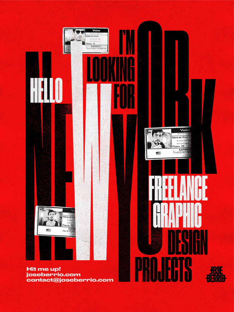
Stylish Poster Design by Jose Berrio
Stylish Poster Design by Jose Berrio abduzeedoAug 15, 2019 Jose Berrio shared a really cool project of personal poster design on his Behance profile. They have all this dirty look, with some very stylish typography and textures. They bring back some old school movie posters, almost punk look. I liked the idea of creating personal projects to not only promote your skills but as away to let people know you are available for new projects. It's a way to differentiate yourself from the crowd. Jose is a a Colombian graphic designer currently based in Brooklyn. He received a degree in Graphic Design from LCI Bogotá and worked in advertising companies for seven years. I'm currently working as a freelance graphic designer and illustrator. For more information make sure to check out. www.joseberrio.com Poster design
Gustavo Perg 2019 Illustration Work
Gustavo Perg 2019 Illustration Work abduzeedoAug 27, 2019 Gustavo Perg shared a beautiful set of illustrations that he has created in 2019 so far. If you scroll down to the end of the page you will be able to agree with me that 2019 has been an incredible year for Gustavo because the quality and style of his illustration work is off the charts. For those interested to know about Gustavo, he is an art director, graphic designer and illustrator from Sao Paulo Brazil, we definitely recommend that you check out his portfolio at https://www.behance.net/gustavopergoli
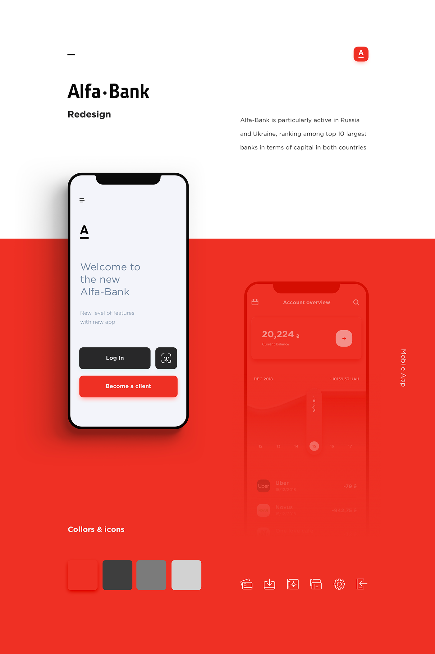
Redesigning the Alfa Bank mobile app
Redesigning the Alfa Bank mobile app AoiroStudioMar 19, 2019 Designers Stas Aristov, Alya Prigotska and Thanh Do decided to redesign the Alfa Bank mobile app. Let's take a closer look! I like the transition of the account overview, it's expressed through two different views with what we would call the "dashboard" and another view where you can select a specific account, send money to someone and your transaction history. The overall UI is clean and the right play with the primary colours, I would have added a second set of colours for secondary actions or additional features. Check it out, props to everyone involved in this redesign. Alfa-Bank is particularly active in Russia and Ukraine, ranking among top 10 largest banks in terms of capital in both countries. Our goal was to create simple and user friendly banking mobile app. Links Behance Credits Stas Aristov Alya Prigotska Thanh Do

Beautiful Character Design by Gustavo Henrique
Beautiful Character Design by Gustavo Henrique abduzeedoMar 29, 2019 Gustavo Henrique shared a beautiful character design project on his Behance profile. He created simple shapes in 3D and added some simple 2D draw on them. Gustavo mentioned that he wanted to give some personalities to these shapes using very simple lines. As he said: "I tried to use less shapes and lines as possible to give them some personality. Although they are very simple I really liked how everything looks good together." In addition, I quite love the way Gustavo played with depth of field, really exaggerating the blur of the background. That created a nice separation between foreground and background. I tried to use less shapes and lines as possible to give them some personality Character Design Illustration
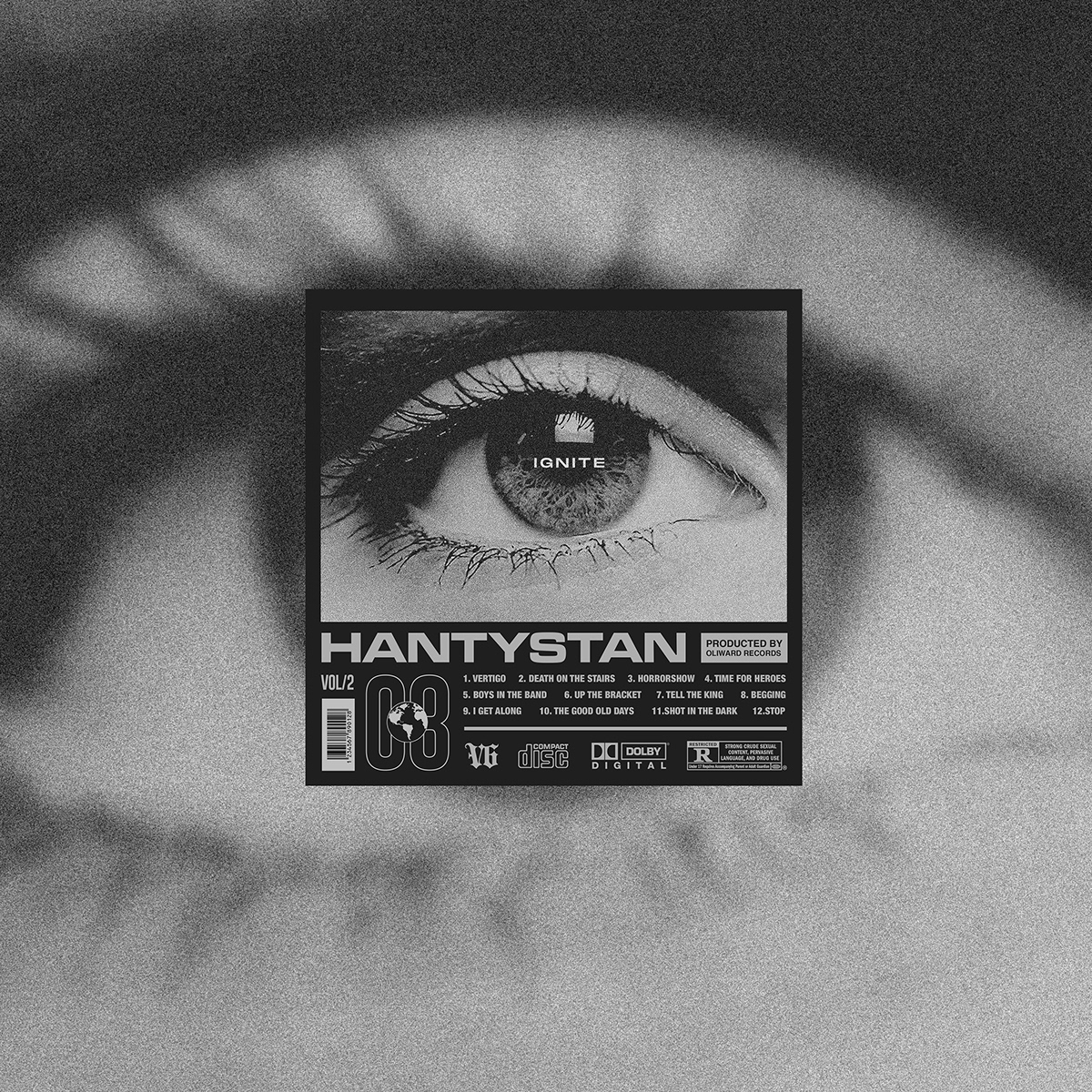
CD Cover Designs to Bring Back that 90s Feeling
CD Cover Designs to Bring Back that 90s Feeling abduzeedoApr 09, 2019 If you had to describe the 90s I am pretty sure compact disks would be part of that short description. Also known as CDs, they were part of that decade and they were also an important medium for designers to showcase their skills on the covers. I dare say that being able to design a CD cover was probably the main goal of any graphic designer. So there’s nothing better than a collection of super awesome CD Cover Designs by HERO INK, a designer based in France, to bring back the nostalgic feelings of that long gone grunge era. CD Cover Designs
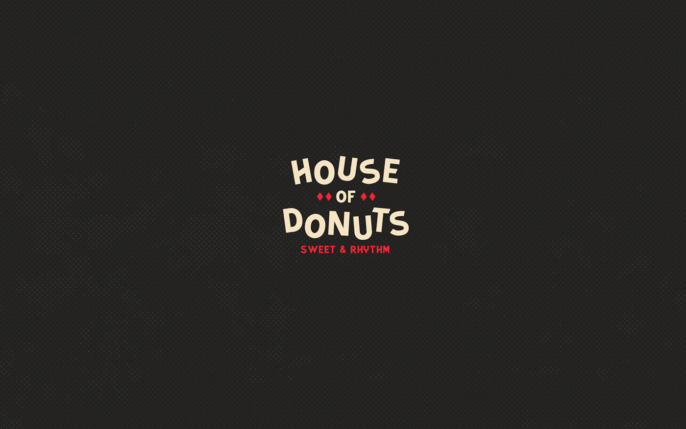
House of Donuts Playful Visual Identity System
House of Donuts Playful Visual Identity System abduzeedoOct 15, 2019 Donuts, oh donuts! It’s hard to resist the temptation of those little fried pieces of dough. To make things even harder Mariana Font and César Romero created a colorful and fun visual identity for House of Donuts. By playing with typography, colors and pattern they created a beautiful system that is playful but super modern and elegant. I personally love the packaging and printed materials. The website is awesome great, especially the hamburger menu. Visual Identity Marina is a graphic designer from Venezuela, currently based in Buenos Aires, Argentina. Cesar Romero is a graphic designer based in Santiago, Chile. For more information make sure to follow them Marina on Instagram
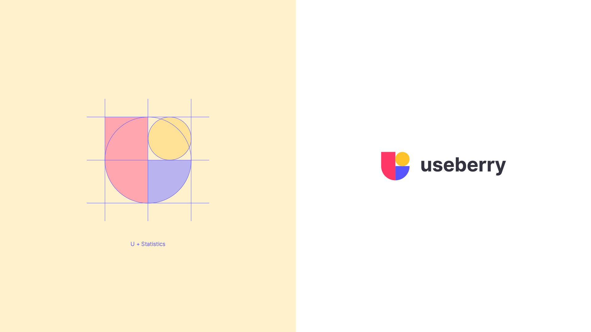
Undivided Rebranding & UI/UX for Useberry
Undivided Rebranding & UI/UX for Useberry AoiroStudioMay 20, 2019 holy ™ is an agency of all sorts of services, from branding all the way to the user interface design. Based in Athens, Greece, they shared on their Behance, a major rebranding & UI/UX for Useberry. They have revamped their entire look from visual identity, UI/UX, iconography, illustrations, animations and even copywriting. Useberry is an intuitive user-testing tool, which provides codeless prototype analytics. Props to the entire team at holy ™ for this amazing work, I love the fact they used the Inter UI font by Rasmus Andersson. I also appreciate the fact they shared UI design for the results page for example. Something we dearly get to see on published projects, usually we rarely get passed the "sign-up onboarding". A great challenge though was useberry platform’s UI/UX design, which not only needed to be light, clean and intuitive, but also able to address design community’s claims for functional and good design. More Links Studio Site Behance Visual Identity User Onboarding Dashboard Test Sharing Prototype Creation Results Follow holy™ on Behance
Muse + Mettā Kombucha Brand Identity by Kati Forner
Muse + Mettā Kombucha Brand Identity by Kati Forner ibbyJun 10, 2019 It's no secret we're big fans of the work coming from Kati Forner Design having showcased some past work of hers here on Abduzeedo. Of late we're swooning over the most recent work for Kombucha brand Muse + Mettā founded by Trent Brokie . Most definitely the most beautiful Kombucha bottle we ever did see, I can picture myself enjoying the Wild Blueberry and Lavender steep and then repurposing this gorgeous bottle as a home decor piece. The concept behind the work goes something like this: The color of each flavor complements the ingredient profile highlighting Muse + Mettā Kombucha's identity as more than just a beverage but a culture of health, art, and possibility. While you're here, be sure to check Muse + Mettā's Instagram page for a visual schooling on how to launch a product on this social platform in the most beautiful way. We believe food can feed us both physically and creatively. Brewed with fruits, flowers and herbs from around the world coupled with a passion for modern design and wellness to create a truly sensory experience
Monday Motion Design Inspiration - Symbiose
Monday Motion Design Inspiration - Symbiose abduzeedoJul 15, 2019 Bring back another edition of our sometimes forgotten series, Monday Motion Design Inspiration, we are excited to feature the project that Benjamin CROCHET shared on his Behance profile. Titled Symbiose, this project is a fictive AI device, creating and transmitting sounds by bone conduction to help user feel better. Shapes and colors graphically represent the current state/mental health of the user, and its evolution after using the device. Motion Design Stills More information Benjamin Crochet. is a creative designer, based in Paris, France. He is specialized in motion, art direction, graphic design and his portfolio is simply awesome. Make sure to check it out. Web: benjamincrochet.com Instagram: @ben.crochet
Graphic Design for Adidas Predator by Gordon Reid
Graphic Design for Adidas Predator by Gordon Reid abduzeedoMar 25, 2019 Gordon Reid shared a beautiful graphic design project for Adidas and one of their most iconic soccer (football) boots in history, The Predator. Adidas London wanted to create a range of new print, digital and social ads to mark the relaunch of this historic boot along with the launch of two new boots, the X and Nemeziz. Gordon worked with the strapline for each boot to create illustrated assets for each boot. Each created to compliment the culture, history and design of each of the boots. For Instance, the Predator played on more of a retro, bold and graphic feel, whereas the X artwork played on the enhanced speed element and Nemeziz was all about being agile. Each artwork was brought to life using a bold color palette and strong graphical elements that could be used throughout the advertising. Graphic Design
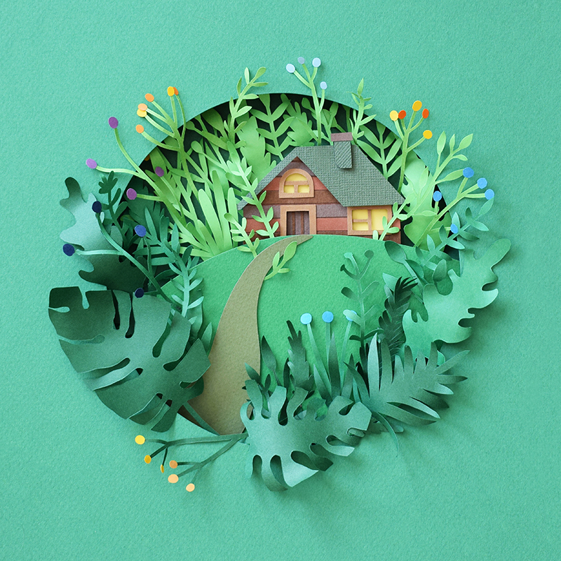
Beautiful Paper Art Work by Margaret Scrinkl
Beautiful Paper Art Work by Margaret Scrinkl ibbyJun 09, 2019 Margaret Scrinkl has been posting some very intricate paper art projects. I am a fan of 3D and photo manipulation, but you cannot beat the look and feel of a real handcrafted product. The textures, the light and most importantly how organic it feels. Computer generated images tend to be too perfect, they lack the subtle flaws that something made with real materials will show, like the different way the border of the paper looks after bing cut with scissors, or simple the fact that the curves are not perfectly uniform. There are many details that make Margaret's work special. Below you see the one titled House Jungle. You can also purchase this and many others. Printable art is available in her Etsy shop Paper Art

006 - User Profile #dailyui
DailyUI #006 / User profile

Music Talents - User Profile

Day 006 - User Profile
NYC Taxi App
Hi mates! Some time ago I worked on a taxi application and was inspired to make my own one. I made some research and interviewed a target audience to be able to create a useful and comfortable product that corresponds to all user's needs. Advice and opinions are welcome :) Tags: taxi map ui ux app application design wireframe mockup minimal clean light white blue flat mobile ios iPhone android optimization user interface experience interactive layout navigation search profile icon illustration animation
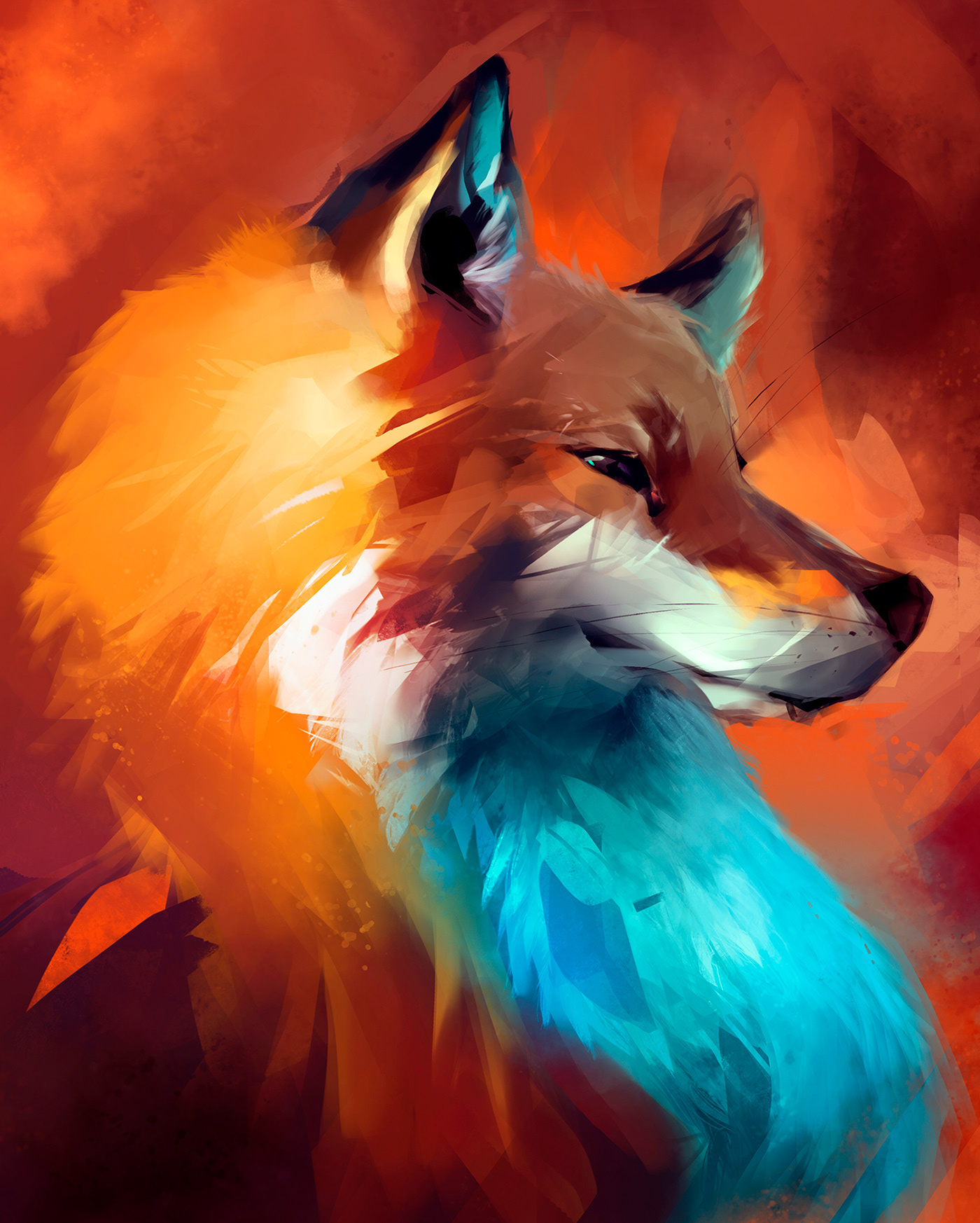
Animal Painting Studies by Guilherme Asthma
Animal Painting Studies by Guilherme Asthma AoiroStudioJul 29, 2019 Guilherme Asthma is a freelance visual artist from São Paulo, Brazil, he shared a stunning and impressive animal painting studies using Photoshop (for one) and a photograph as a reference. These are righteously fascinating! I took the liberty to share its entire project, my favorite one is actually the 'fox'. I mean just take a look at the different spots of lighting and colors. It's a true master and his craft and it's going to keep on making greater art. Make sure to follow Guilherme' work. Paintings & Digital Art Work by Guilherme Asthma More on Guilherme Asthma Personal Site Behance ArtStation

DailyUI#006 - User Profile
Get access to thousands of freshly updated design inspiration pieces by adding Muzli to your browser.
Loved by 750K designers worldwide, Muzli is the leading go-to browser extension for creative professionals.
The Power of a Well-Designed Profile Page: More than Just Aesthetics
In today's digital age, our online presence has taken on a level of importance that few could have predicted a couple of decades ago. A crucial component of this online persona is the profile page, which acts as a window into who we are and what we represent. This might be on social media, a professional networking site, a personal website, or even a forum. So, what makes a well-designed profile page so essential?
1. First Impressions Matter
The saying, "Don't judge a book by its cover," although wise, is often overlooked in the online realm. Most viewers will make snap judgments based on what they see. A well-designed profile page that's clean, organized, and aesthetically pleasing can create a strong and positive first impression.
2. A Reflection of Your Brand
For professionals and businesses, a profile page often serves as a brand touchpoint. It tells visitors what you're about, what you value, and the kind of work or service you offer. A cluttered or inconsistent profile can convey a lack of professionalism, while a sleek, consistent design can bolster brand trust.
3. Improved Usability
A well-designed profile doesn't just look good; it functions efficiently. Users should be able to quickly access the information they're seeking, whether it's your contact details, portfolio, or any other relevant information. Good design facilitates this ease of navigation.
4. Showcasing Personality
While conveying professionalism is essential, so is showcasing personality. A unique and well-thought-out profile page can give visitors a sense of who you are, not just what you do. It allows for personal expression and can make your profile memorable.
5. Building Trust
Especially in professional networking or e-commerce settings, trust is paramount. A well-designed profile page, complete with authentic photos, comprehensive details about skills or services, and genuine testimonials or recommendations, can build this trust.
6. Optimized for Engagement
Good design often considers the user's journey. By strategically placing call-to-action buttons or interactive elements on your profile page, you can guide visitors towards desired actions, be it connecting, following, buying, or simply learning more about you.
7. Adaptability Across Devices
In our increasingly mobile world, a well-designed profile is adaptable across devices. This means it looks and functions seamlessly, whether viewed on a desktop, tablet, or smartphone. This adaptability ensures you put your best foot forward, regardless of how someone accesses your profile.
In Conclusion
A profile page is often the starting point of online interactions, both personal and professional. Its design, thus, holds more power than one might initially realize. It's not just about aesthetic appeal; it's about communication, brand-building, trust, and engagement. Investing time and thought into crafting a standout profile page can yield dividends in the long run, enhancing connections and opportunities in our interconnected digital landscape.